


Hola, my lovelies…
It’s been a while since I’ve posted, but that’s because I’ve been busy, busy!
Here’s the update:
VIRTUALLY YOURS: I’ve decided the spruce up the first 50 pages. About half of my betas complain of one thing: that they are lost in those first few pages. (The other half get it.) There are a lot of characters and the story lines are interconnected and it’s hard to get the gist of the plot until the characters and the plots are established. I KNOW THIS. But, it’s a great story (I think) and with a little tweaking, it could be better.
I have a few more small publishers I’m going to query, and then, da da da daaaaah! I think I’ll take the plunge and e-pub. Perhaps by the end of the year.
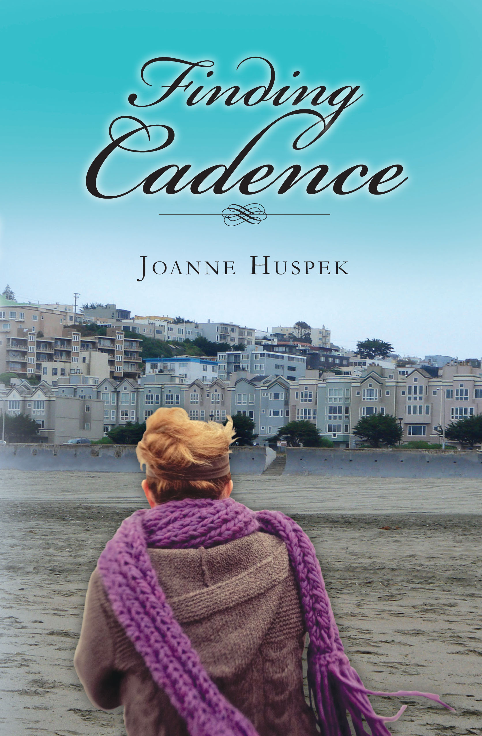
This means I’m giving it another once over (or two) and make it really, really tight. It also means I’m developing a cover, which is where some of my attention has been going. I’ve had some really boffo designs thrown my way, and it’s hard to choose, but I think I’m going to go for the eye-catcher.
Which is why this post concentrates on covers. No matter what they say, covers ARE important. E-book covers are especially important. I’ve been perusing the offerings at Smashwords, and with the exception of the book description, which have to be brief, professional word candy, the covers are a vital necessity. We need a visual effect to draw us into the story.
There is always a deal maker and a deal breaker. I can’t tell you how many novels I have purchased because the covers feature a photo of the Golden Gate Bridge. Conversely, there are books I have walked away from because the art work didn’t grab me.
Maybe the Holy Bible can get away without cover art, but rarely will any work of fiction do without. Covers on e-books or print, must draw the reader to open the book, or to click on the link for more information.
That being said, I find it mildly humorous that many print cover books are exactly alike. It’s not just the Harlequin romance novels either, most of which feature bodice ripping hunks and voluptuous main characters. Most mystery/thriller type books are in dark colors with bold typeface. Paranormals are often black, with Gothic type. I’ve noticed in my genre (women’s literature) that there are so many books featuring a photo of a body of water (lake, stream, ocean) and the back of a woman’s head and torso as she is overlooking it. Or just the back of her legs.
I’ve seen two books featuring an Asian storyline with nearly the same cover: the back of a Japanese/Chinese woman with chopsticks in her hair. What is weird is that the titles are very similar as well.
I attended a workshop at the San Francisco Writers Conference given by an editor at Grand Central. Even the big houses make big boo-boos when it comes to reusing covers. She held up two different books by different authors with the exact same cover art, released at almost the same time. Ouch!
This proves that tried and true formulas may not be the best.
As for me and my work, VIRTUALLY YOURS, doesn’t conform to the romance genre. (It’s mom-lit, remember?) It’s so different (as some of my rejection letters have indicated), it defies being firmly pigeonholed. My cover is going to have to be as different as the words inside. I had an idea of what I wanted, but the people who are designers and have sent me cover ideas took it down a completely different path.
In a word, I’m pleased. I hope you are too. 🙂

4 Responses to You CAN Judge a Book by Its Cover